You can see a live demo on my blog, the buttons are located on the right side.
How to put Go Up and Go Down buttons using the jQuery slide effect
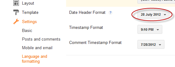
Step 1. Go to Template, click on the Edit HTML button

Step 2. Click anywhere inside the code area and press the CTRL + F keys to open the Blogger search box
Step 3. Copy and paste the following piece of code inside the search box in order to find it:
]]></b:skin>Step 4. Just above ]]></b:skin> paste this one:
/* Up and Down Buttons with jQueryNote: - in green are some annotations that explains what styles you can modify on their left side.
----------------------------------------------- */
.button_up{
padding:7px; /* Distance between the border and the icon */
background-color:white;
border:1px solid #CCC; /* Border Color */
position:fixed;
background: white url(https://blogger.googleusercontent.com/img/b/R29vZ2xl/AVvXsEjMt51ZcM4TAui5e7wZyy8Rn1yEDmyJA6gWlP1aTUN1sS1fa6O7ZAyoVUfs2p8xam6WOD9LVSXAJjFDJOStUp5XABGE_d6iy-Pbt-tMdOXoQTrs6UaR358_ghouys_s_ZZYMyXuNuA63Eo/s16/arrow_up.png) no-repeat top left;
background-position:50% 50%;
width:20px; /* Button's width */
height:20px; /* Button's height */
bottom:280px; /* Distance from the bottom */
right:5px; /* Change right to left if you want the buttons on the left */
white-space:nowrap;
cursor: pointer;
border-radius: 3px 3px 3px 3px;
opacity:0.7;
filter:progid:DXImageTransform.Microsoft.Alpha(opacity=70);
}
.button_down{
padding:7px; /* Distance between the border and the icon */
background-color:white;
border:1px solid #CCC; /* Border Color */
position:fixed;
background: white url(https://blogger.googleusercontent.com/img/b/R29vZ2xl/AVvXsEgfd2ymcF_09v_U6wjsT8gJORi-mOMauoG05qcUrg-ICIWiFWRP71fhmUxmYCS44fJ2Mp3bKp7wHM6ek8sCnJbm7RoGuFgWXPFzHHF2W1vxhKrYQAQmB-hAnWrVKudtqAjOwZSu0_wOeM4/s16/arrow_down.png) no-repeat top left;
background-position:50% 50%;
width:20px; /* Button's width */
height:20px; /* Button's height */
bottom:242px; /* Distance from the bottom */
right:5px; /* Change right to left if you want the buttons on the left */
white-space:nowrap;
cursor: pointer;
border-radius: 3px 3px 3px 3px;
opacity:0.7;
filter:progid:DXImageTransform.Microsoft.Alpha(opacity=70);
}
- You can change the arrows by changing the URLs in blue.
- To change the buttons background color of buttons, change the white text with your color
Step 5. Now search (CTRL + F) for the following tag:
</body>Step 6. And just above it, paste the code below:
<script src='http://ajax.googleapis.com/ajax/libs/jquery/1.7.1/jquery.min.js' type='text/javascript'/>
<div class='button_up' id='button_up' style='display:none;'/>
<div class='button_down' id='button_down' style='display:none;'/>
<script>
//<![CDATA[
(function(){var special=jQuery.event.special,uid1='D'+(+new Date()),uid2='D'+(+new Date()+1);special.scrollstart={setup:function(){var timer,handler=function(evt){var _self=this,_args=arguments;if(timer){clearTimeout(timer)}else{evt.type='scrollstart';jQuery.event.handle.apply(_self,_args)}timer=setTimeout(function(){timer=null},special.scrollstop.latency)};jQuery(this).bind('scroll',handler).data(uid1,handler)},teardown:function(){jQuery(this).unbind('scroll',jQuery(this).data(uid1))}};special.scrollstop={latency:300,setup:function(){var timer,handler=function(evt){var _self=this,_args=arguments;if(timer){clearTimeout(timer)}timer=setTimeout(function(){timer=null;evt.type='scrollstop';jQuery.event.handle.apply(_self,_args)},special.scrollstop.latency)};jQuery(this).bind('scroll',handler).data(uid2,handler)},teardown:function(){jQuery(this).unbind('scroll',jQuery(this).data(uid2))}}})();
$(function() {
var $elem = $('body');
$('#button_up').fadeIn('slow');
$('#button_down').fadeIn('slow');
$(window).bind('scrollstart', function(){
$('#button_up,#button_down').stop().animate({'opacity':'0.2'});
});
$(window).bind('scrollstop', function(){
$('#button_up,#button_down').stop().animate({'opacity':'1'});
});
$('#button_down').click(
function (e) {
$('html, body').animate({scrollTop: $elem.height()}, 800);
} );
$('#button_up').click(
function (e) {
$('html, body').animate({scrollTop: '0px'}, 800);
} );});
//]]>
</script>
Note: In case you want to remove the "Go to top" button, remove the 1st bolded code and to remove the "Go to bottom" button, remove the 2nd one.
Step 7. Finally, Save your changes by clicking on the Save template button. Enjoy!